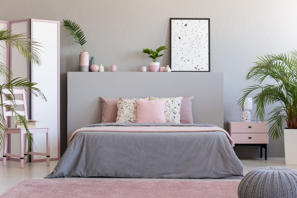
Do you want to decorate with pink, but are afraid the color may look too juvenile?
While a valid concern, there are many ways to incorporate a pink color scheme that remains modern and mature.
Find the most gorgeous pink color schemes right here, along with complementary shades that will enhance the beauty of your interior design.
Color Theory
The basis of color theory is the color wheel and the psychological feeling specific colors impart.
Most people are aware of complementary shades found opposite it on the color wheel. What most people don’t know is that other cohesive color scheme looks can also be:
- Monochromatic – one color in various intensities
- Analogous – three colors next to each other on the color wheel
- Triadic – colors equally distant from each other on the color wheel
- Tetradic – two sets of complementary colors
Pink’s complementary color is a yellowish-green, with variants dependent on hue.
Pink has a fantastic range of color options. You can take the feeling of a room from soft, peaceful, and nurturing to one of energy and passion using these remarkable combinations below.
#1: Rosy-Pink and Gray
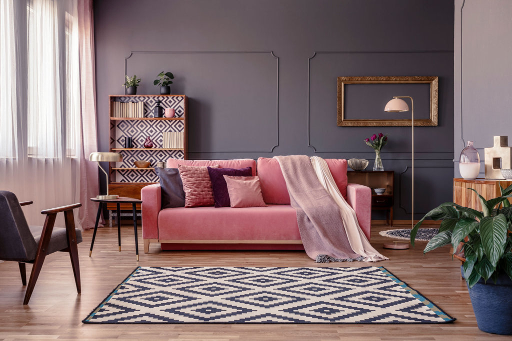
The balance of color intensity between the rosy-pink and gray elevate this color scheme into something crisp and modern, yet serene and comforting.
A room abundant with natural light is perfect for mid-range hues of pink and grey. As the day passes, the colors appear to change tones and keep the space looking interesting. Yet, in the evening, they are not too dark.
Adding light cream as an accent color and bringing in texture in the rug and shelf backdrop brings maturity to this design.
Recreate this look by keeping the walls and decor one color and adding a pink couch as the main focal point. Pops of white or cream add dimension without becoming overwhelming.
#2: Pink and Teal Green
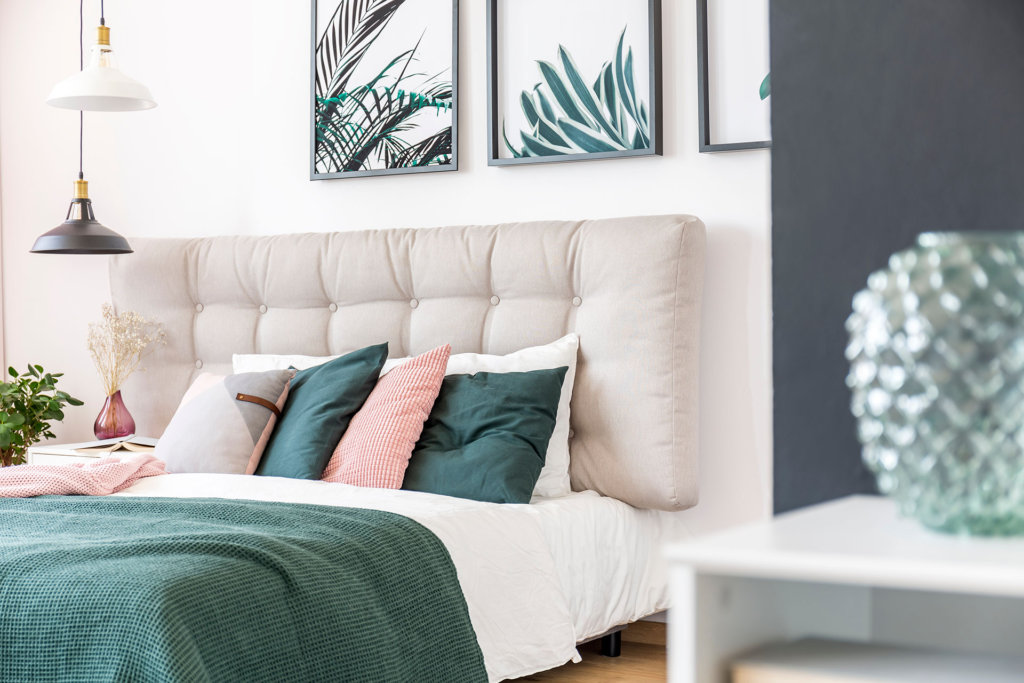
A soft pink paired with a gentle teal green and balanced with a deep gray is unexpected, yet incredibly cozy and inviting.
The touches of pink shades in the accent pillows, blanket, and vase take the edge off what could otherwise be a harsh color combination.
Recreate this look by taking a pink softened by lots of white, and pairing it with its complementary shade of green (leaning toward the blue spectrum) in a more intense hue. Use the pink tone sparingly about the space to bring all the room’s colors harmoniously together.
#3: Beige-Pink and Soft White
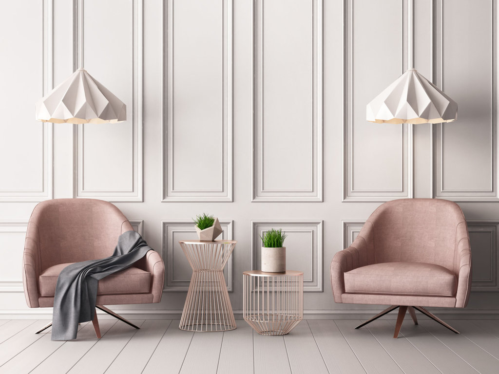
Very pale pink with beige undertones paired with a soft white is understated, modern, and yet timeless. The pastel tones are a peaceful backdrop to the eye, letting the mid-hue grey of the throw and the pop of green foliage bring life to the space.
The style of furnishings can make this color combination contemporary, using streamlined designs. Alternatively, use overstuffed couches and chairs to make it comfy and cozy. The color combination is gentle and imparts a feeling of calmness and serenity.
Recreate this look by keeping the floor and walls white and bringing in pink furniture pieces and a small pop of vibrant color. Avoid a one-dimensional feel by adding moldings to the walls and unique light fixtures.
#4: Pink and Crimson
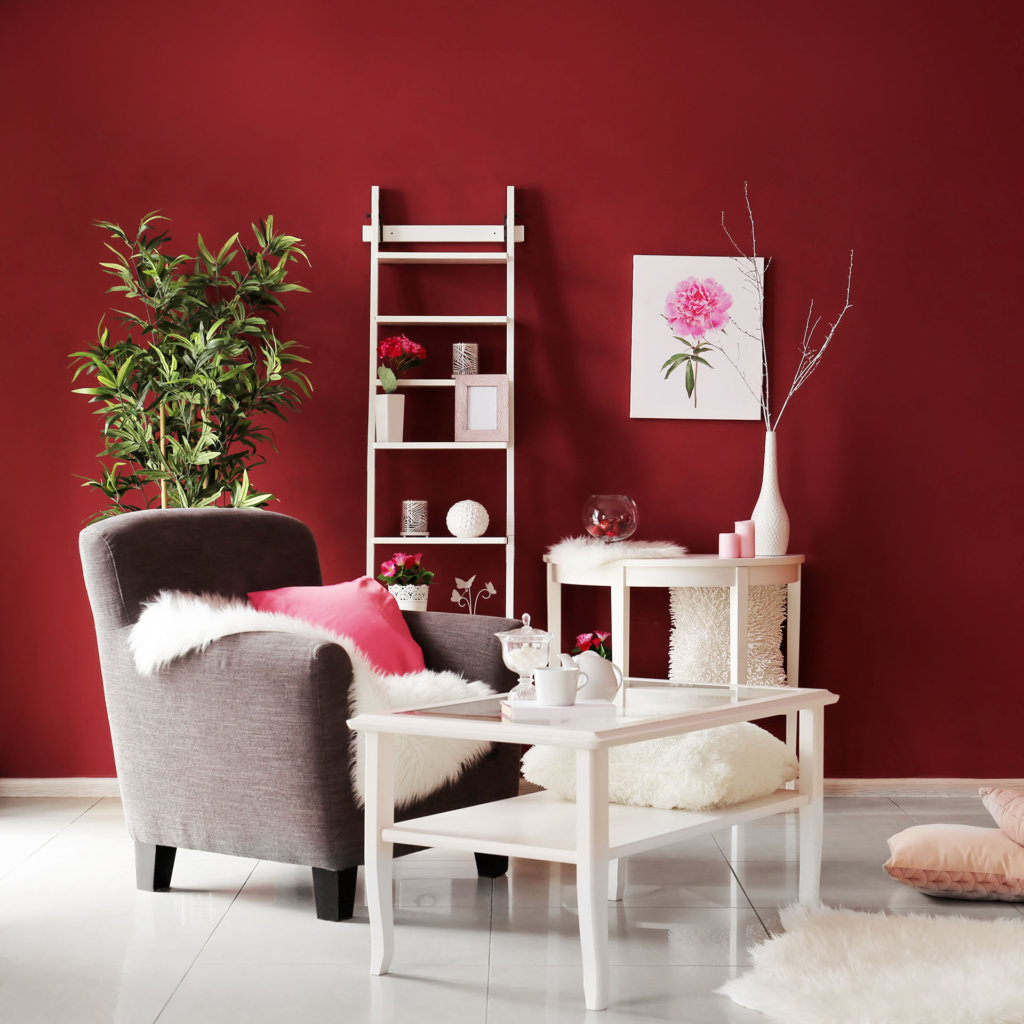
For a room with a creative and thoughtful vibe, try pairing a vibrant mid-hue pink with crimson or burgundy. Technically members of the same color family, they seamlessly co-exist without being jarring to the eye.
Pink brings vibrancy to an otherwise dark-tone wall that could make a room feel too serious. The grey chair and pure white furnishings further enhance the color. The touches of pink are minimal, which means you can try different shades and gain a whole new look.
Recreate this look by choosing a deep red for the walls while keeping the tables and accessories white. The tone of the gray chair matches the intensity of the pink hue, creating a balance that helps visually ground the room.
#5: Deep Dusty Rose and Deep Gray
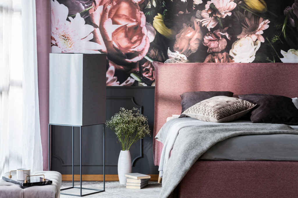
This modern and romantic look stems from the clever balance between the deep dusty rose pink that borders on plum against super dark greys. Lighter grey becomes neutral and gives the eye a visual rest amid the large floral pattern.
What brings this color scheme together is the pops of yellow-green, as it’s the complementary shade to the pink. Without it, the room would appear less dimensional and a bit boring.
Recreate this look by finding a sizeable floral wallpaper mural that features tones of dusty pink from pale to intense over a dark background. Highlight the pink with a headboard, bed, and curtains done in a matching upholstery color. Balance the room with light gray bedding, furniture, and flooring.
#6: Pale Pink and Forest Green
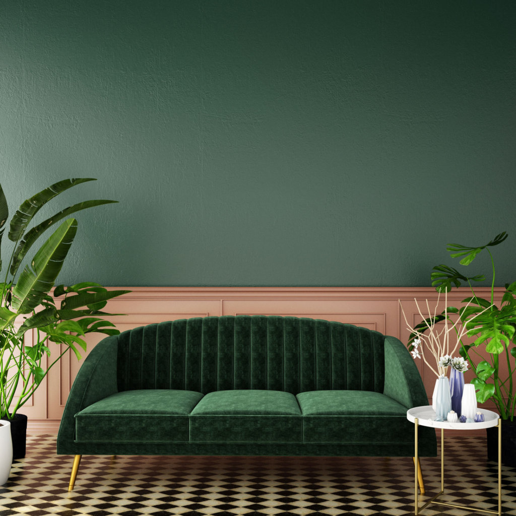
For an updated retro feel, pair a rich pale pink with an ever-so-slightly muted forest green. The color combination brings a feeling of wealth, nature, and vitality to any space.
What makes this color scheme so pleasing is that it’s gentle on the eyes and brings a sensation of calmness. The use of pink on the lower wall continues flowing into the flooring, which adds a lightness to the room and sets off the statement couch.
Recreate this look by using pink wainscotting and a pink and black checked flooring. Paint upper walls a forest green color. Keep the profile of the deeper-intensity green couch low to help set it off against the pink backdrop. Add real plants and minimal white accessories to make the main color combo even more exciting.
#7: Bubblegum Pink and Vibrant Green
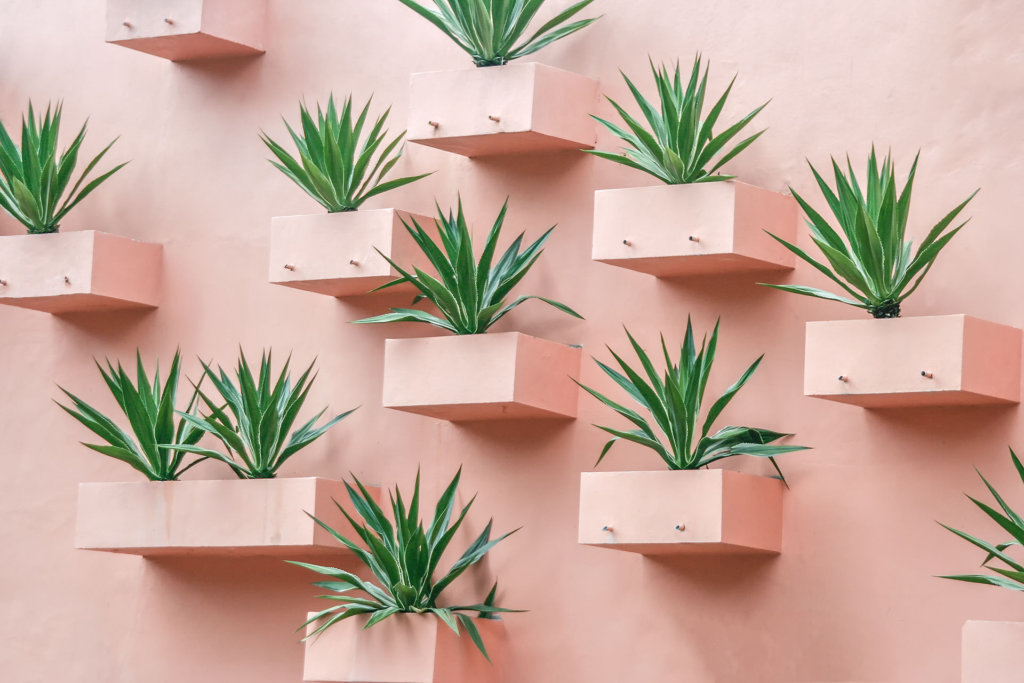
For a fresh and lively space, opt for bubblegum pink paired with a vibrant green. These two colors complement each other perfectly, while the green shade tells your brain you’re in a natural setting, which calms the senses.
What makes this color scheme impressive is that the tones are subtle yet bring forth a brightness when together that is uplifting to the spirit without looking too childish.
Recreate this look by painting the walls a crisp mid-hue pink then offset the background with plants that display foliage in bright green or with one bold green couch. Accessorize with pure white or cream to update the final look.
#8: Pink and Golden Orange
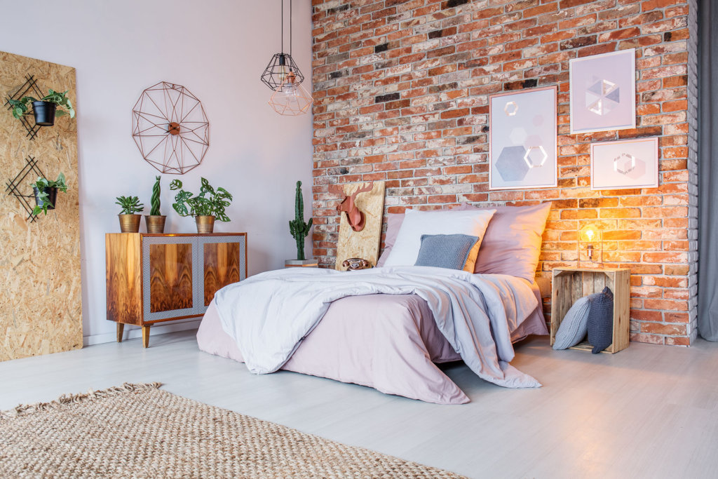
Soft pink is the perfect complement to golden beige or orange tones and can prevent a space from looking too masculine. Using the triad theory with pink brings you to these less intense shades of orange that are harmonious in hue, so the room seems curated.
What makes this unusual color combination work is the shade of pink picks up the warm tones in the brick and other furnishings. The addition of pink brings just enough femininity and a touch of elegance to the room.
Recreate this look by finding a shade of pink that works with the colors in the brick wall. Bring the pink in with large pillows and a thick comforter on the bed, and add in other pink touches like the sleek picture frame on the wall. Keep the rest of the palette on walls and flooring a neutral beige.
#9: Hot Pink Tones and White
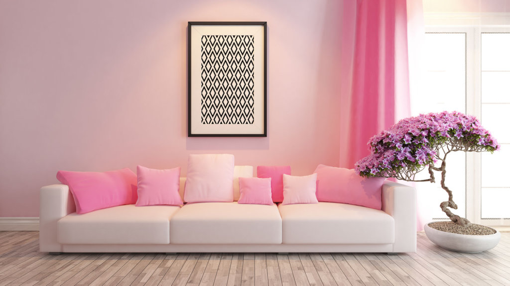
Using vibrant pink in a monochromatic fashion against white is fresh, modern, and uplifting to the senses. The variations in shade bring a ton of interest and enliven an otherwise blank space, without being busy.
With four or more shades of the same pink color, the eye gently wanders around, making the room feel spacious. Use the analogous theory and choose purple in a matching tone for accessories to help heighten the energy level even more.
Recreate this look using light grey flooring and walls in one of the lighter shades of pink from your monochromatic scale. The key is the pure white couch and trim that set off the pink, making it the star of the room. Pop in some mid-tone purple accents to finish the look.
#10: Fushia, Turquoise, Yellow, and Grey
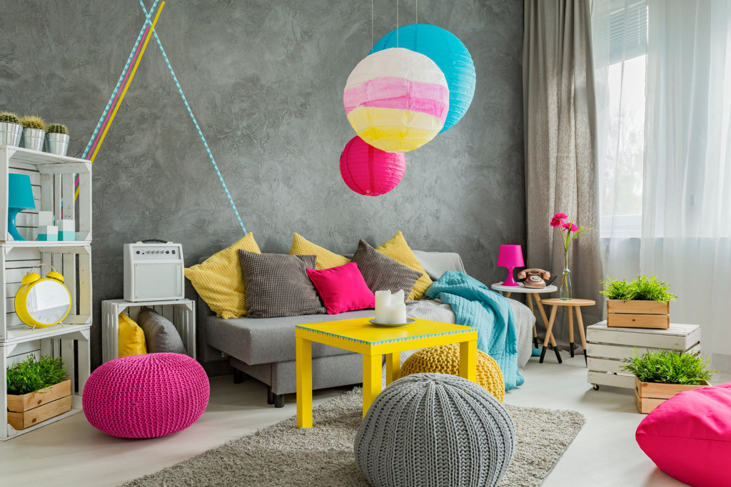
For a true expression of fearless personality, design your room around a bold fuchsia pink, a bright yellow, and a turquoise blue using the triad theory. The intensity of the colors imparts a playful vibe, but the cool tones of the gray backdrop bring it back to pop-art modernity.
The full-on grey walls, curtains, and furniture can drag down a space, but the contrast of the intense pink is equally balanced by the blue and yellow and pulls the room together into a cohesive style.
Recreate this look by going for a deeper gray on walls and furniture that can hold it’s own against the bright pink, blue, and yellow. Add white accessories and bits of natural wood and foliage to calm the bold colors and give the eye a resting spot.

